| 1 | // Copyright 2014 The Flutter Authors. All rights reserved. |
| 2 | // Use of this source code is governed by a BSD-style license that can be |
|---|
| 3 | // found in the LICENSE file. |
|---|
| 4 | |
|---|
| 5 | /// @docImport 'package:flutter/material.dart'; |
|---|
| 6 | /// |
|---|
| 7 | /// @docImport 'decorated_sliver.dart'; |
|---|
| 8 | /// @docImport 'implicit_animations.dart'; |
|---|
| 9 | /// @docImport 'transitions.dart'; |
|---|
| 10 | library; |
|---|
| 11 | |
|---|
| 12 | import 'package:flutter/foundation.dart'; |
|---|
| 13 | import 'package:flutter/rendering.dart'; |
|---|
| 14 | |
|---|
| 15 | import 'basic.dart'; |
|---|
| 16 | import 'framework.dart'; |
|---|
| 17 | import 'image.dart'; |
|---|
| 18 | |
|---|
| 19 | // Examples can assume: |
|---|
| 20 | // late BuildContext context; |
|---|
| 21 | |
|---|
| 22 | /// A widget that paints a [Decoration] either before or after its child paints. |
|---|
| 23 | /// |
|---|
| 24 | /// [Container] insets its child by the widths of the borders; this widget does |
|---|
| 25 | /// not. |
|---|
| 26 | /// |
|---|
| 27 | /// Commonly used with [BoxDecoration]. |
|---|
| 28 | /// |
|---|
| 29 | /// The [child] is not clipped. To clip a child to the shape of a particular |
|---|
| 30 | /// [ShapeDecoration], consider using a [ClipPath] widget. |
|---|
| 31 | /// |
|---|
| 32 | /// {@tool snippet} |
|---|
| 33 | /// |
|---|
| 34 | /// This sample shows a radial gradient that draws a moon on a night sky: |
|---|
| 35 | /// |
|---|
| 36 | /// ```dart |
|---|
| 37 | /// const DecoratedBox( |
|---|
| 38 | /// decoration: BoxDecoration( |
|---|
| 39 | /// gradient: RadialGradient( |
|---|
| 40 | /// center: Alignment(-0.5, -0.6), |
|---|
| 41 | /// radius: 0.15, |
|---|
| 42 | /// colors: <Color>[ |
|---|
| 43 | /// Color(0xFFEEEEEE), |
|---|
| 44 | /// Color(0xFF111133), |
|---|
| 45 | /// ], |
|---|
| 46 | /// stops: <double>[0.9, 1.0], |
|---|
| 47 | /// ), |
|---|
| 48 | /// ), |
|---|
| 49 | /// ) |
|---|
| 50 | /// ``` |
|---|
| 51 | /// {@end-tool} |
|---|
| 52 | /// |
|---|
| 53 | /// See also: |
|---|
| 54 | /// |
|---|
| 55 | /// * [Ink], which paints a [Decoration] on a [Material], allowing |
|---|
| 56 | /// [InkResponse] and [InkWell] splashes to paint over them. |
|---|
| 57 | /// * [DecoratedBoxTransition], the version of this class that animates on the |
|---|
| 58 | /// [decoration] property. |
|---|
| 59 | /// * [Decoration], which you can extend to provide other effects with |
|---|
| 60 | /// [DecoratedBox]. |
|---|
| 61 | /// * [CustomPaint], another way to draw custom effects from the widget layer. |
|---|
| 62 | /// * [DecoratedSliver], which applies a [Decoration] to a sliver. |
|---|
| 63 | class DecoratedBox extends SingleChildRenderObjectWidget { |
|---|
| 64 | /// Creates a widget that paints a [Decoration]. |
|---|
| 65 | /// |
|---|
| 66 | /// By default the decoration paints behind the child. |
|---|
| 67 | const DecoratedBox({ |
|---|
| 68 | super.key, |
|---|
| 69 | required this.decoration, |
|---|
| 70 | this.position = DecorationPosition.background, |
|---|
| 71 | super.child, |
|---|
| 72 | }); |
|---|
| 73 | |
|---|
| 74 | /// What decoration to paint. |
|---|
| 75 | /// |
|---|
| 76 | /// Commonly a [BoxDecoration]. |
|---|
| 77 | final Decoration decoration; |
|---|
| 78 | |
|---|
| 79 | /// Whether to paint the box decoration behind or in front of the child. |
|---|
| 80 | final DecorationPosition position; |
|---|
| 81 | |
|---|
| 82 | @override |
|---|
| 83 | RenderDecoratedBox createRenderObject(BuildContext context) { |
|---|
| 84 | return RenderDecoratedBox( |
|---|
| 85 | decoration: decoration, |
|---|
| 86 | position: position, |
|---|
| 87 | configuration: createLocalImageConfiguration(context), |
|---|
| 88 | ); |
|---|
| 89 | } |
|---|
| 90 | |
|---|
| 91 | @override |
|---|
| 92 | void updateRenderObject(BuildContext context, RenderDecoratedBox renderObject) { |
|---|
| 93 | renderObject |
|---|
| 94 | ..decoration = decoration |
|---|
| 95 | ..configuration = createLocalImageConfiguration(context) |
|---|
| 96 | ..position = position; |
|---|
| 97 | } |
|---|
| 98 | |
|---|
| 99 | @override |
|---|
| 100 | void debugFillProperties(DiagnosticPropertiesBuilder properties) { |
|---|
| 101 | super.debugFillProperties(properties); |
|---|
| 102 | final String label = switch (position) { |
|---|
| 103 | DecorationPosition.background => 'bg' , |
|---|
| 104 | DecorationPosition.foreground => 'fg' , |
|---|
| 105 | }; |
|---|
| 106 | properties.add( |
|---|
| 107 | EnumProperty<DecorationPosition>('position' , position, level: DiagnosticLevel.hidden), |
|---|
| 108 | ); |
|---|
| 109 | properties.add(DiagnosticsProperty<Decoration>(label, decoration)); |
|---|
| 110 | } |
|---|
| 111 | } |
|---|
| 112 | |
|---|
| 113 | /// A convenience widget that combines common painting, positioning, and sizing |
|---|
| 114 | /// widgets. |
|---|
| 115 | /// |
|---|
| 116 | /// {@youtube 560 315 https://www.youtube.com/watch?v=c1xLMaTUWCY} |
|---|
| 117 | /// |
|---|
| 118 | /// A container first surrounds the child with [padding] (inflated by any |
|---|
| 119 | /// borders present in the [decoration]) and then applies additional |
|---|
| 120 | /// [constraints] to the padded extent (incorporating the `width` and `height` |
|---|
| 121 | /// as constraints, if either is non-null). The container is then surrounded by |
|---|
| 122 | /// additional empty space described from the [margin]. |
|---|
| 123 | /// |
|---|
| 124 | /// During painting, the container first applies the given [transform], then |
|---|
| 125 | /// paints the [decoration] to fill the padded extent, then it paints the child, |
|---|
| 126 | /// and finally paints the [foregroundDecoration], also filling the padded |
|---|
| 127 | /// extent. |
|---|
| 128 | /// |
|---|
| 129 | /// Containers with no children try to be as big as possible unless the incoming |
|---|
| 130 | /// constraints are unbounded, in which case they try to be as small as |
|---|
| 131 | /// possible. Containers with children size themselves to their children. The |
|---|
| 132 | /// `width`, `height`, and [constraints] arguments to the constructor override |
|---|
| 133 | /// this. |
|---|
| 134 | /// |
|---|
| 135 | /// By default, containers return false for all hit tests. If the [color] |
|---|
| 136 | /// property is specified, the hit testing is handled by [ColoredBox], which |
|---|
| 137 | /// always returns true. If the [decoration] or [foregroundDecoration] properties |
|---|
| 138 | /// are specified, hit testing is handled by [Decoration.hitTest]. |
|---|
| 139 | /// |
|---|
| 140 | /// ## Layout behavior |
|---|
| 141 | /// |
|---|
| 142 | /// _See [BoxConstraints] for an introduction to box layout models._ |
|---|
| 143 | /// |
|---|
| 144 | /// Since [Container] combines a number of other widgets each with their own |
|---|
| 145 | /// layout behavior, [Container]'s layout behavior is somewhat complicated. |
|---|
| 146 | /// |
|---|
| 147 | /// Summary: [Container] tries, in order: to honor [alignment], to size itself |
|---|
| 148 | /// to the [child], to honor the `width`, `height`, and [constraints], to expand |
|---|
| 149 | /// to fit the parent, to be as small as possible. |
|---|
| 150 | /// |
|---|
| 151 | /// More specifically: |
|---|
| 152 | /// |
|---|
| 153 | /// If the widget has no child, no `height`, no `width`, no [constraints], |
|---|
| 154 | /// and the parent provides unbounded constraints, then [Container] tries to |
|---|
| 155 | /// size as small as possible. |
|---|
| 156 | /// |
|---|
| 157 | /// If the widget has no child and no [alignment], but a `height`, `width`, or |
|---|
| 158 | /// [constraints] are provided, then the [Container] tries to be as small as |
|---|
| 159 | /// possible given the combination of those constraints and the parent's |
|---|
| 160 | /// constraints. |
|---|
| 161 | /// |
|---|
| 162 | /// If the widget has no child, no `height`, no `width`, no [constraints], and |
|---|
| 163 | /// no [alignment], but the parent provides bounded constraints, then |
|---|
| 164 | /// [Container] expands to fit the constraints provided by the parent. |
|---|
| 165 | /// |
|---|
| 166 | /// If the widget has an [alignment], and the parent provides unbounded |
|---|
| 167 | /// constraints, then the [Container] tries to size itself around the child. |
|---|
| 168 | /// |
|---|
| 169 | /// If the widget has an [alignment], and the parent provides bounded |
|---|
| 170 | /// constraints, then the [Container] tries to expand to fit the parent, and |
|---|
| 171 | /// then positions the child within itself as per the [alignment]. |
|---|
| 172 | /// |
|---|
| 173 | /// Otherwise, the widget has a [child] but no `height`, no `width`, no |
|---|
| 174 | /// [constraints], and no [alignment], and the [Container] passes the |
|---|
| 175 | /// constraints from the parent to the child and sizes itself to match the |
|---|
| 176 | /// child. |
|---|
| 177 | /// |
|---|
| 178 | /// The [margin] and [padding] properties also affect the layout, as described |
|---|
| 179 | /// in the documentation for those properties. (Their effects merely augment the |
|---|
| 180 | /// rules described above.) The [decoration] can implicitly increase the |
|---|
| 181 | /// [padding] (e.g. borders in a [BoxDecoration] contribute to the [padding]); |
|---|
| 182 | /// see [Decoration.padding]. |
|---|
| 183 | /// |
|---|
| 184 | /// ## Example |
|---|
| 185 | /// |
|---|
| 186 | /// {@tool snippet} |
|---|
| 187 | /// This example shows a 48x48 amber square (placed inside a [Center] widget in |
|---|
| 188 | /// case the parent widget has its own opinions regarding the size that the |
|---|
| 189 | /// [Container] should take), with a margin so that it stays away from |
|---|
| 190 | /// neighboring widgets: |
|---|
| 191 | /// |
|---|
| 192 | ///  |
|---|
| 193 | /// |
|---|
| 194 | /// ```dart |
|---|
| 195 | /// Center( |
|---|
| 196 | /// child: Container( |
|---|
| 197 | /// margin: const EdgeInsets.all(10.0), |
|---|
| 198 | /// color: Colors.amber[600], |
|---|
| 199 | /// width: 48.0, |
|---|
| 200 | /// height: 48.0, |
|---|
| 201 | /// ), |
|---|
| 202 | /// ) |
|---|
| 203 | /// ``` |
|---|
| 204 | /// {@end-tool} |
|---|
| 205 | /// |
|---|
| 206 | /// {@tool snippet} |
|---|
| 207 | /// |
|---|
| 208 | /// This example shows how to use many of the features of [Container] at once. |
|---|
| 209 | /// The [constraints] are set to fit the font size plus ample headroom |
|---|
| 210 | /// vertically, while expanding horizontally to fit the parent. The [padding] is |
|---|
| 211 | /// used to make sure there is space between the contents and the text. The |
|---|
| 212 | /// [color] makes the box blue. The [alignment] causes the [child] to be |
|---|
| 213 | /// centered in the box. Finally, the [transform] applies a slight rotation to the |
|---|
| 214 | /// entire contraption to complete the effect. |
|---|
| 215 | /// |
|---|
| 216 | /// 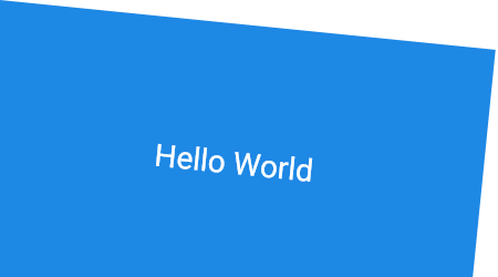 |
|---|
| 218 | /// |
|---|
| 219 | /// ```dart |
|---|
| 220 | /// Container( |
|---|
| 221 | /// constraints: BoxConstraints.expand( |
|---|
| 222 | /// height: Theme.of(context).textTheme.headlineMedium!.fontSize! * 1.1 + 200.0, |
|---|
| 223 | /// ), |
|---|
| 224 | /// padding: const EdgeInsets.all(8.0), |
|---|
| 225 | /// color: Colors.blue[600], |
|---|
| 226 | /// alignment: Alignment.center, |
|---|
| 227 | /// transform: Matrix4.rotationZ(0.1), |
|---|
| 228 | /// child: Text('Hello World', |
|---|
| 229 | /// style: Theme.of(context) |
|---|
| 230 | /// .textTheme |
|---|
| 231 | /// .headlineMedium! |
|---|
| 232 | /// .copyWith(color: Colors.white)), |
|---|
| 233 | /// ) |
|---|
| 234 | /// ``` |
|---|
| 235 | /// {@end-tool} |
|---|
| 236 | /// |
|---|
| 237 | /// See also: |
|---|
| 238 | /// |
|---|
| 239 | /// * [AnimatedContainer], a variant that smoothly animates the properties when |
|---|
| 240 | /// they change. |
|---|
| 241 | /// * [Border], which has a sample which uses [Container] heavily. |
|---|
| 242 | /// * [Ink], which paints a [Decoration] on a [Material], allowing |
|---|
| 243 | /// [InkResponse] and [InkWell] splashes to paint over them. |
|---|
| 244 | /// * Cookbook: [Animate the properties of a container](https://docs.flutter.dev/cookbook/animation/animated-container) |
|---|
| 245 | /// * The [catalog of layout widgets](https://docs.flutter.dev/ui/widgets/layout). |
|---|
| 246 | class Container extends StatelessWidget { |
|---|
| 247 | /// Creates a widget that combines common painting, positioning, and sizing widgets. |
|---|
| 248 | /// |
|---|
| 249 | /// The `height` and `width` values include the padding. |
|---|
| 250 | /// |
|---|
| 251 | /// The `color` and `decoration` arguments cannot both be supplied, since |
|---|
| 252 | /// it would potentially result in the decoration drawing over the background |
|---|
| 253 | /// color. To supply a decoration with a color, use `decoration: |
|---|
| 254 | /// BoxDecoration(color: color)`. |
|---|
| 255 | Container({ |
|---|
| 256 | super.key, |
|---|
| 257 | this.alignment, |
|---|
| 258 | this.padding, |
|---|
| 259 | this.color, |
|---|
| 260 | this.decoration, |
|---|
| 261 | this.foregroundDecoration, |
|---|
| 262 | double? width, |
|---|
| 263 | double? height, |
|---|
| 264 | BoxConstraints? constraints, |
|---|
| 265 | this.margin, |
|---|
| 266 | this.transform, |
|---|
| 267 | this.transformAlignment, |
|---|
| 268 | this.child, |
|---|
| 269 | this.clipBehavior = Clip.none, |
|---|
| 270 | }) : assert(margin == null || margin.isNonNegative), |
|---|
| 271 | assert(padding == null || padding.isNonNegative), |
|---|
| 272 | assert(decoration == null || decoration.debugAssertIsValid()), |
|---|
| 273 | assert(constraints == null || constraints.debugAssertIsValid()), |
|---|
| 274 | assert(decoration != null || clipBehavior == Clip.none), |
|---|
| 275 | assert( |
|---|
| 276 | color == null || decoration == null, |
|---|
| 277 | 'Cannot provide both a color and a decoration\n' |
|---|
| 278 | 'To provide both, use "decoration: BoxDecoration(color: color)".' , |
|---|
| 279 | ), |
|---|
| 280 | constraints = |
|---|
| 281 | (width != null || height != null) |
|---|
| 282 | ? constraints?.tighten(width: width, height: height) ?? |
|---|
| 283 | BoxConstraints.tightFor(width: width, height: height) |
|---|
| 284 | : constraints; |
|---|
| 285 | |
|---|
| 286 | /// The [child] contained by the container. |
|---|
| 287 | /// |
|---|
| 288 | /// If null, and if the [constraints] are unbounded or also null, the |
|---|
| 289 | /// container will expand to fill all available space in its parent, unless |
|---|
| 290 | /// the parent provides unbounded constraints, in which case the container |
|---|
| 291 | /// will attempt to be as small as possible. |
|---|
| 292 | /// |
|---|
| 293 | /// {@macro flutter.widgets.ProxyWidget.child} |
|---|
| 294 | final Widget? child; |
|---|
| 295 | |
|---|
| 296 | /// Align the [child] within the container. |
|---|
| 297 | /// |
|---|
| 298 | /// If non-null, the container will expand to fill its parent and position its |
|---|
| 299 | /// child within itself according to the given value. If the incoming |
|---|
| 300 | /// constraints are unbounded, then the child will be shrink-wrapped instead. |
|---|
| 301 | /// |
|---|
| 302 | /// Ignored if [child] is null. |
|---|
| 303 | /// |
|---|
| 304 | /// See also: |
|---|
| 305 | /// |
|---|
| 306 | /// * [Alignment], a class with convenient constants typically used to |
|---|
| 307 | /// specify an [AlignmentGeometry]. |
|---|
| 308 | /// * [AlignmentDirectional], like [Alignment] for specifying alignments |
|---|
| 309 | /// relative to text direction. |
|---|
| 310 | final AlignmentGeometry? alignment; |
|---|
| 311 | |
|---|
| 312 | /// Empty space to inscribe inside the [decoration]. The [child], if any, is |
|---|
| 313 | /// placed inside this padding. |
|---|
| 314 | /// |
|---|
| 315 | /// This padding is in addition to any padding inherent in the [decoration]; |
|---|
| 316 | /// see [Decoration.padding]. |
|---|
| 317 | final EdgeInsetsGeometry? padding; |
|---|
| 318 | |
|---|
| 319 | /// The color to paint behind the [child]. |
|---|
| 320 | /// |
|---|
| 321 | /// This property should be preferred when the background is a simple color. |
|---|
| 322 | /// For other cases, such as gradients or images, use the [decoration] |
|---|
| 323 | /// property. |
|---|
| 324 | /// |
|---|
| 325 | /// If the [decoration] is used, this property must be null. A background |
|---|
| 326 | /// color may still be painted by the [decoration] even if this property is |
|---|
| 327 | /// null. |
|---|
| 328 | final Color? color; |
|---|
| 329 | |
|---|
| 330 | /// The decoration to paint behind the [child]. |
|---|
| 331 | /// |
|---|
| 332 | /// Use the [color] property to specify a simple solid color. |
|---|
| 333 | /// |
|---|
| 334 | /// The [child] is not clipped to the decoration. To clip a child to the shape |
|---|
| 335 | /// of a particular [ShapeDecoration], consider using a [ClipPath] widget. |
|---|
| 336 | final Decoration? decoration; |
|---|
| 337 | |
|---|
| 338 | /// The decoration to paint in front of the [child]. |
|---|
| 339 | final Decoration? foregroundDecoration; |
|---|
| 340 | |
|---|
| 341 | /// Additional constraints to apply to the child. |
|---|
| 342 | /// |
|---|
| 343 | /// The constructor `width` and `height` arguments are combined with the |
|---|
| 344 | /// `constraints` argument to set this property. |
|---|
| 345 | /// |
|---|
| 346 | /// The [padding] goes inside the constraints. |
|---|
| 347 | final BoxConstraints? constraints; |
|---|
| 348 | |
|---|
| 349 | /// Empty space to surround the [decoration] and [child]. |
|---|
| 350 | final EdgeInsetsGeometry? margin; |
|---|
| 351 | |
|---|
| 352 | /// The transformation matrix to apply before painting the container. |
|---|
| 353 | final Matrix4? transform; |
|---|
| 354 | |
|---|
| 355 | /// The alignment of the origin, relative to the size of the container, if [transform] is specified. |
|---|
| 356 | /// |
|---|
| 357 | /// When [transform] is null, the value of this property is ignored. |
|---|
| 358 | /// |
|---|
| 359 | /// See also: |
|---|
| 360 | /// |
|---|
| 361 | /// * [Transform.alignment], which is set by this property. |
|---|
| 362 | final AlignmentGeometry? transformAlignment; |
|---|
| 363 | |
|---|
| 364 | /// The clip behavior when [Container.decoration] is not null. |
|---|
| 365 | /// |
|---|
| 366 | /// Defaults to [Clip.none]. Must be [Clip.none] if [decoration] is null. |
|---|
| 367 | /// |
|---|
| 368 | /// If a clip is to be applied, the [Decoration.getClipPath] method |
|---|
| 369 | /// for the provided decoration must return a clip path. (This is not |
|---|
| 370 | /// supported by all decorations; the default implementation of that |
|---|
| 371 | /// method throws an [UnsupportedError].) |
|---|
| 372 | final Clip clipBehavior; |
|---|
| 373 | |
|---|
| 374 | EdgeInsetsGeometry? get _paddingIncludingDecoration { |
|---|
| 375 | return switch ((padding, decoration?.padding)) { |
|---|
| 376 | (null, final EdgeInsetsGeometry? padding) => padding, |
|---|
| 377 | (final EdgeInsetsGeometry? padding, null) => padding, |
|---|
| 378 | (_) => padding!.add(decoration!.padding), |
|---|
| 379 | }; |
|---|
| 380 | } |
|---|
| 381 | |
|---|
| 382 | @override |
|---|
| 383 | Widget build(BuildContext context) { |
|---|
| 384 | Widget? current = child; |
|---|
| 385 | |
|---|
| 386 | if (child == null && (constraints == null || !constraints!.isTight)) { |
|---|
| 387 | current = LimitedBox( |
|---|
| 388 | maxWidth: 0.0, |
|---|
| 389 | maxHeight: 0.0, |
|---|
| 390 | child: ConstrainedBox(constraints: const BoxConstraints.expand()), |
|---|
| 391 | ); |
|---|
| 392 | } else if (alignment != null) { |
|---|
| 393 | current = Align(alignment: alignment!, child: current); |
|---|
| 394 | } |
|---|
| 395 | |
|---|
| 396 | final EdgeInsetsGeometry? effectivePadding = _paddingIncludingDecoration; |
|---|
| 397 | if (effectivePadding != null) { |
|---|
| 398 | current = Padding(padding: effectivePadding, child: current); |
|---|
| 399 | } |
|---|
| 400 | |
|---|
| 401 | if (color != null) { |
|---|
| 402 | current = ColoredBox(color: color!, child: current); |
|---|
| 403 | } |
|---|
| 404 | |
|---|
| 405 | if (clipBehavior != Clip.none) { |
|---|
| 406 | assert(decoration != null); |
|---|
| 407 | current = ClipPath( |
|---|
| 408 | clipper: _DecorationClipper( |
|---|
| 409 | textDirection: Directionality.maybeOf(context), |
|---|
| 410 | decoration: decoration!, |
|---|
| 411 | ), |
|---|
| 412 | clipBehavior: clipBehavior, |
|---|
| 413 | child: current, |
|---|
| 414 | ); |
|---|
| 415 | } |
|---|
| 416 | |
|---|
| 417 | if (decoration != null) { |
|---|
| 418 | current = DecoratedBox(decoration: decoration!, child: current); |
|---|
| 419 | } |
|---|
| 420 | |
|---|
| 421 | if (foregroundDecoration != null) { |
|---|
| 422 | current = DecoratedBox( |
|---|
| 423 | decoration: foregroundDecoration!, |
|---|
| 424 | position: DecorationPosition.foreground, |
|---|
| 425 | child: current, |
|---|
| 426 | ); |
|---|
| 427 | } |
|---|
| 428 | |
|---|
| 429 | if (constraints != null) { |
|---|
| 430 | current = ConstrainedBox(constraints: constraints!, child: current); |
|---|
| 431 | } |
|---|
| 432 | |
|---|
| 433 | if (margin != null) { |
|---|
| 434 | current = Padding(padding: margin!, child: current); |
|---|
| 435 | } |
|---|
| 436 | |
|---|
| 437 | if (transform != null) { |
|---|
| 438 | current = Transform(transform: transform!, alignment: transformAlignment, child: current); |
|---|
| 439 | } |
|---|
| 440 | |
|---|
| 441 | return current!; |
|---|
| 442 | } |
|---|
| 443 | |
|---|
| 444 | @override |
|---|
| 445 | void debugFillProperties(DiagnosticPropertiesBuilder properties) { |
|---|
| 446 | super.debugFillProperties(properties); |
|---|
| 447 | properties.add( |
|---|
| 448 | DiagnosticsProperty<AlignmentGeometry>( |
|---|
| 449 | 'alignment' , |
|---|
| 450 | alignment, |
|---|
| 451 | showName: false, |
|---|
| 452 | defaultValue: null, |
|---|
| 453 | ), |
|---|
| 454 | ); |
|---|
| 455 | properties.add(DiagnosticsProperty<EdgeInsetsGeometry>('padding' , padding, defaultValue: null)); |
|---|
| 456 | properties.add( |
|---|
| 457 | DiagnosticsProperty<Clip>('clipBehavior' , clipBehavior, defaultValue: Clip.none), |
|---|
| 458 | ); |
|---|
| 459 | if (color != null) { |
|---|
| 460 | properties.add(DiagnosticsProperty<Color>('bg' , color)); |
|---|
| 461 | } else { |
|---|
| 462 | properties.add(DiagnosticsProperty<Decoration>('bg' , decoration, defaultValue: null)); |
|---|
| 463 | } |
|---|
| 464 | properties.add(DiagnosticsProperty<Decoration>('fg' , foregroundDecoration, defaultValue: null)); |
|---|
| 465 | properties.add( |
|---|
| 466 | DiagnosticsProperty<BoxConstraints>('constraints' , constraints, defaultValue: null), |
|---|
| 467 | ); |
|---|
| 468 | properties.add(DiagnosticsProperty<EdgeInsetsGeometry>('margin' , margin, defaultValue: null)); |
|---|
| 469 | properties.add(ObjectFlagProperty<Matrix4>.has('transform' , transform)); |
|---|
| 470 | } |
|---|
| 471 | } |
|---|
| 472 | |
|---|
| 473 | /// A clipper that uses [Decoration.getClipPath] to clip. |
|---|
| 474 | class _DecorationClipper extends CustomClipper<Path> { |
|---|
| 475 | _DecorationClipper({TextDirection? textDirection, required this.decoration}) |
|---|
| 476 | : textDirection = textDirection ?? TextDirection.ltr; |
|---|
| 477 | |
|---|
| 478 | final TextDirection textDirection; |
|---|
| 479 | final Decoration decoration; |
|---|
| 480 | |
|---|
| 481 | @override |
|---|
| 482 | Path getClip(Size size) { |
|---|
| 483 | return decoration.getClipPath(Offset.zero & size, textDirection); |
|---|
| 484 | } |
|---|
| 485 | |
|---|
| 486 | @override |
|---|
| 487 | bool shouldReclip(_DecorationClipper oldClipper) { |
|---|
| 488 | return oldClipper.decoration != decoration || oldClipper.textDirection != textDirection; |
|---|
| 489 | } |
|---|
| 490 | } |
|---|
| 491 | |
|---|
